Latent Logic
Brand identity and website for an autonomous-vehicle simulation company, later acquired by Waymo.
Exploring connection
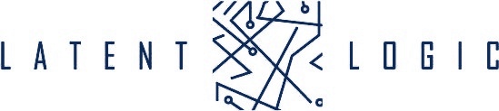
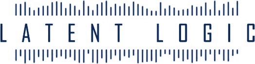
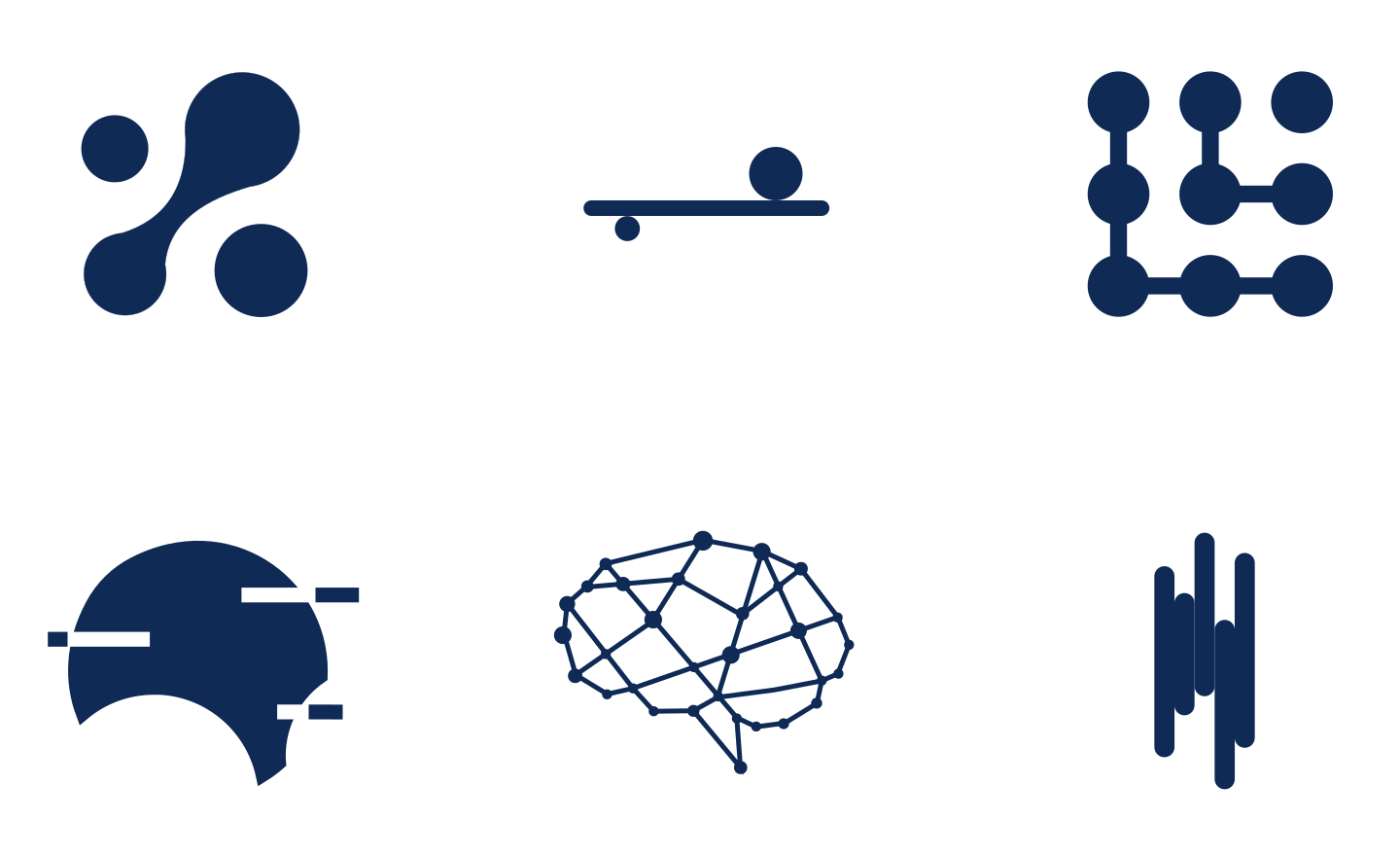
The early studies approached connection in several ways. Circuit-like pathways created intricate networks. Fine lines converged into an abstract central symbol. Waveform-like patterns introduced rhythm around the company name.
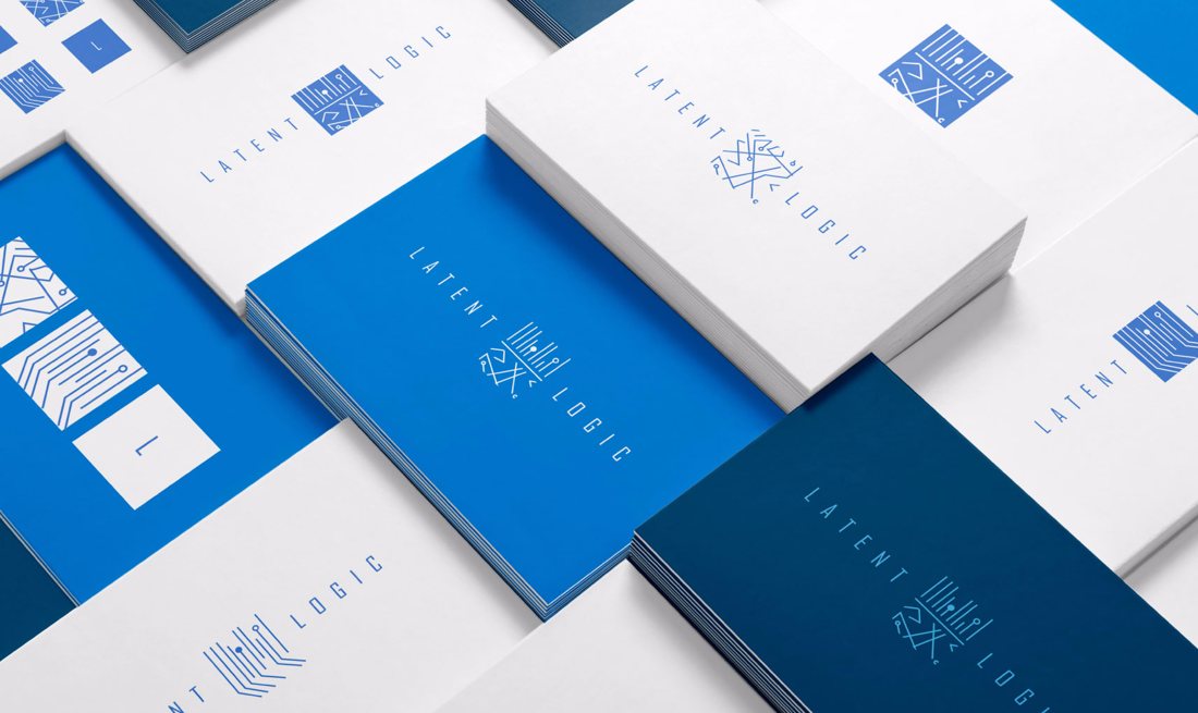
Each direction offered a different balance between image and typography. Presentation studies placed these ideas on light and dark backgrounds and in application mock-ups, extending the exploration beyond the isolated logo.

Bringing the initials into focus
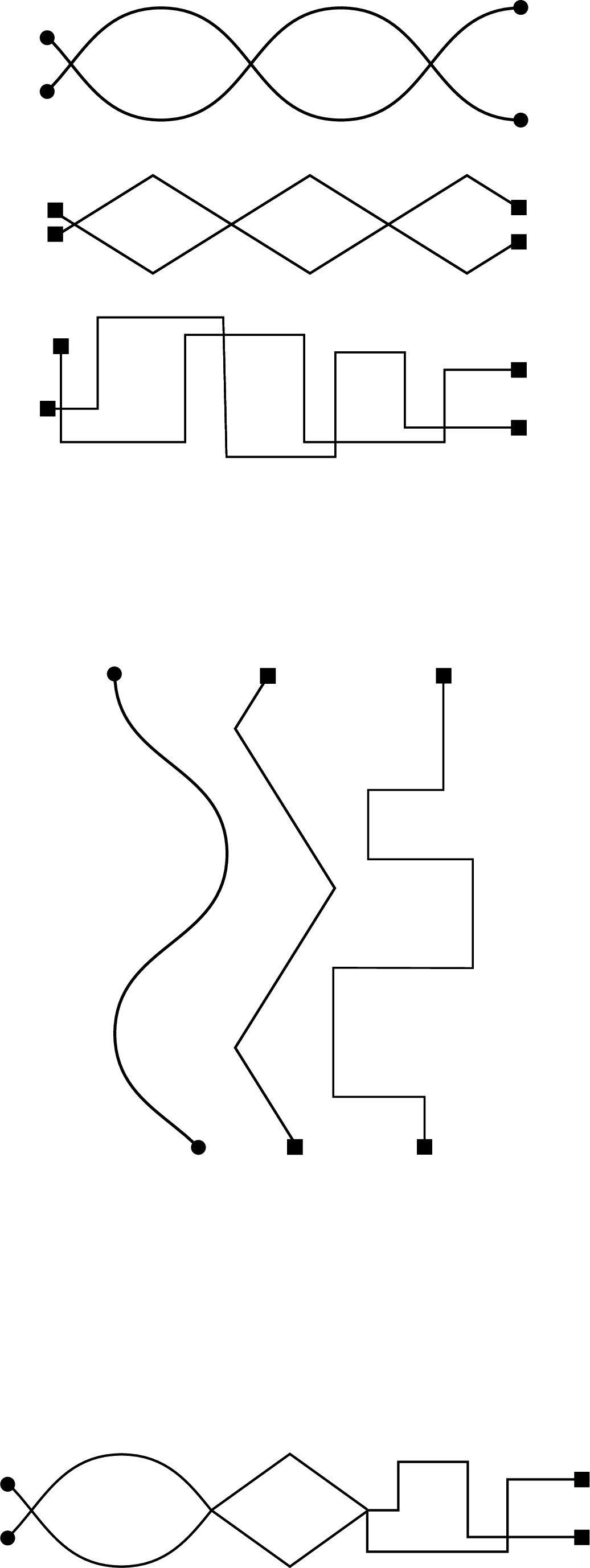
As the work developed, two strands remained visible: experiments with flowing and stepped signals, and a symbol formed from paired L shapes.
The LL direction brought the company’s initials into the graphic itself. Its curved paths and contrasting endpoints retained a sense of connection while creating a more compact form.
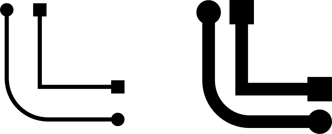
Construction studies explored thin and heavy strokes, circular and square terminals, and different relationships between the two letters.
Finding the right relationship
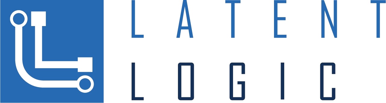
The symbol and name were tested in several arrangements: placed between the words, paired with a stacked wordmark, and contained within a square.
These studies changed the emphasis of the identity. Central placement integrated the symbol into the name; positioning it alongside the stacked words gave it a more independent presence.
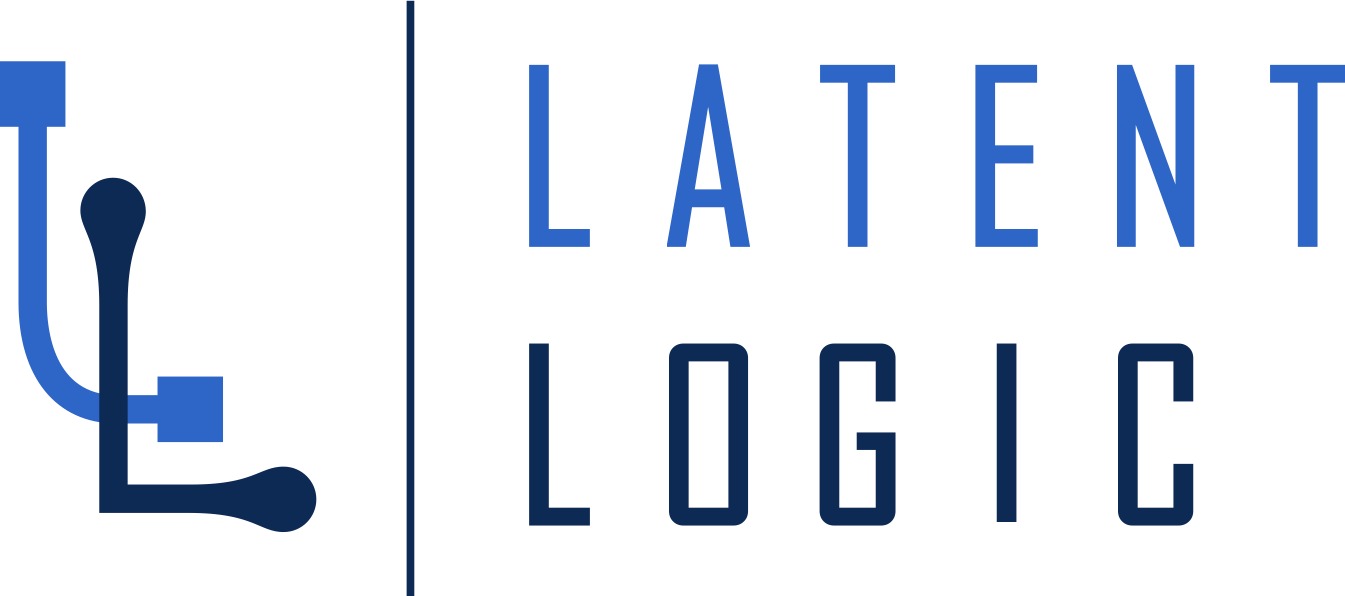
The final arrangement places the symbol beside the wordmark, separated by a fine vertical rule.


Small changes, distinct character
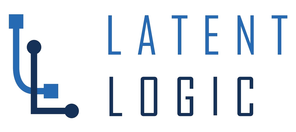
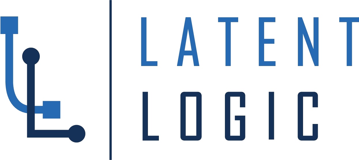
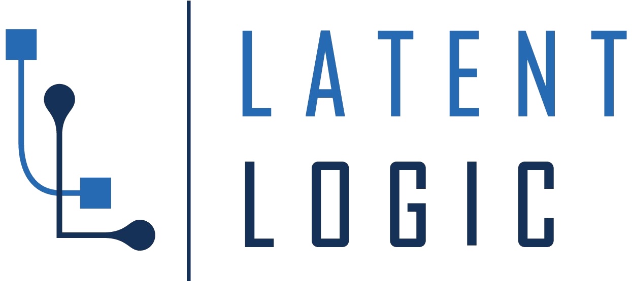
The later rounds concentrated on smaller distinctions. Stroke weight, spacing and terminal shapes changed across closely related alternatives.
The final symbol pairs square terminals on the blue L with rounded, tapered terminals on the navy L. That contrast gives the two forms individual character while keeping them connected within one mark.
A narrow wordmark and generous letter spacing complete the composition.
Selected alternatives from the final study sheet.

Beyond the mark
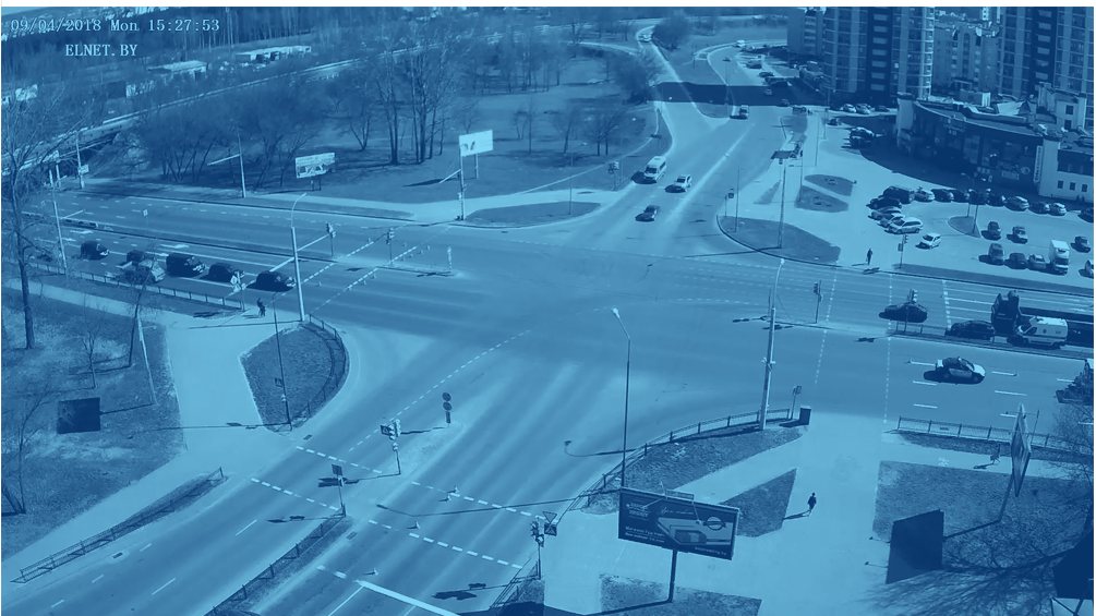
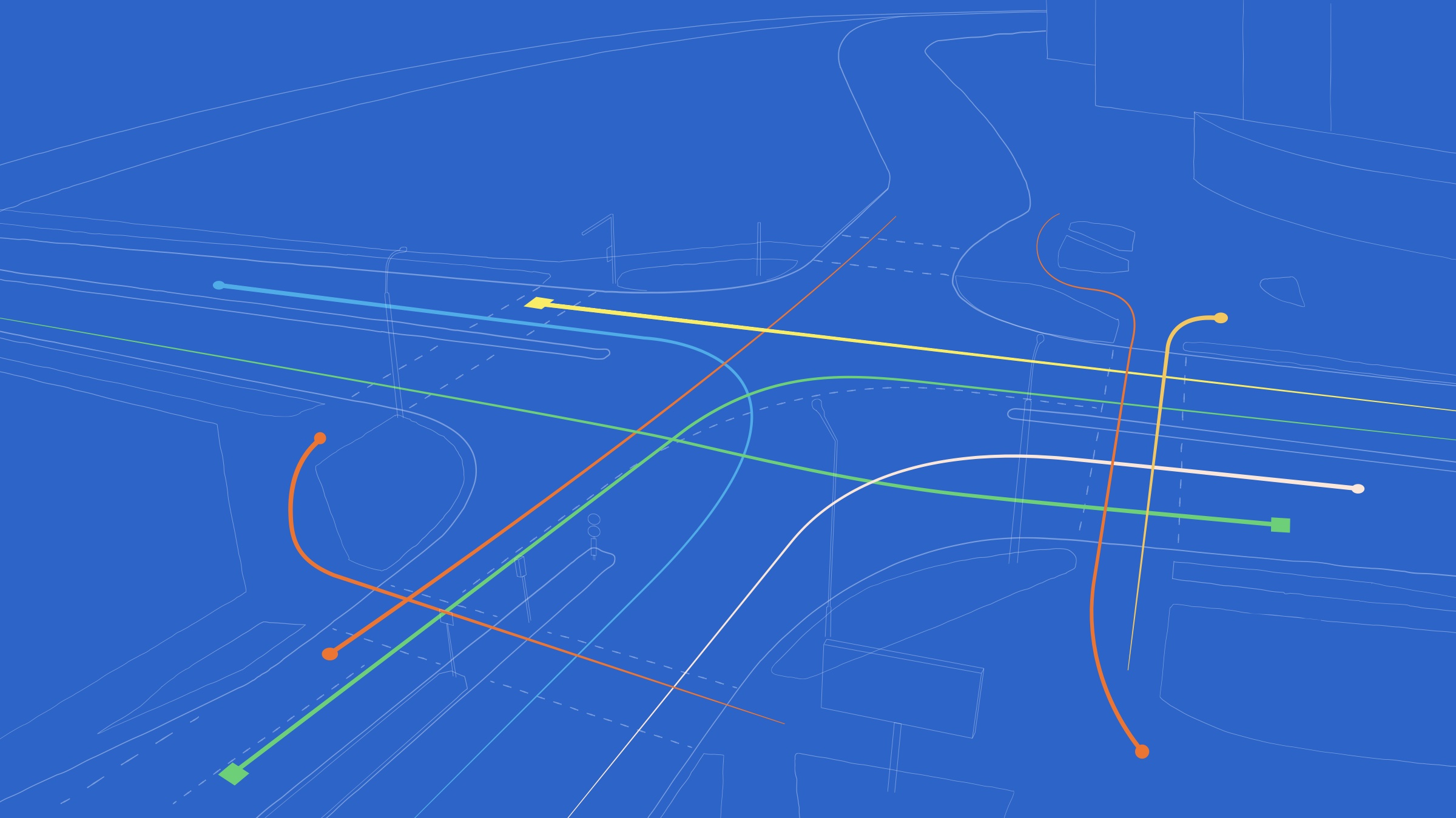
Alongside the logo, the brand exploration considered typography, supporting colours and tinted photography.
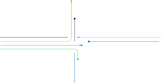
An extended line graphic carried the curved paths and endpoints into a larger composition, exploring how the identity could move beyond the mark itself.

A form of its own
The final identity combines a paired LL symbol with a blue-and-navy wordmark in horizontal and stacked arrangements.
It carries forward the language of connection explored at the beginning, giving it a specific form through the company’s own initials.

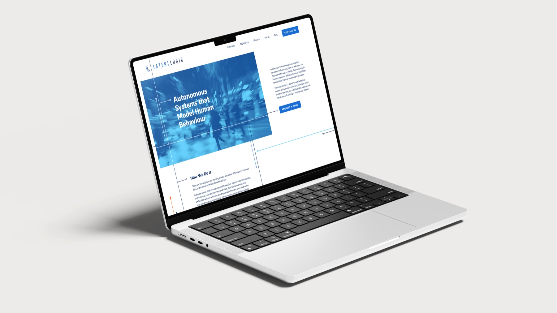
The website
The brand carried into the company’s website.
Project details
- Project
- Brand identity and website
- What I made
- Logo development, identity, website design and build
More work in